Have you ever walked into a room and instantly felt calm, energized, or maybe even a little anxious without knowing why? There’s a good chance the colors surrounding you played a significant role in triggering those emotions. I discovered this firsthand when I transformed my home office from a stark white box to a space with sage green curtains and walls – suddenly, my productivity skyrocketed and the afternoon slumps became less frequent.
Color psychology isn’t just some interior design buzzword; it’s a legitimate field of study that explores how different hues affect our mood, behavior, and even physical responses. When it comes to curtains specifically, these aren’t just functional items keeping the morning sun at bay – they’re substantial blocks of color that can dramatically influence the atmosphere of any room.
Let’s dive into how you can harness the power of color psychology to select curtains that not only look gorgeous but also create the perfect emotional environment for each space in your home.
Understanding the Impact of Colors on Mood
Colors speak a language all their own, communicating directly with our subconscious. This isn’t new-age mumbo jumbo – numerous studies have documented measurable psychological and physiological responses to different colors.
Take blue, for instance. This cool-toned favorite has been shown to lower blood pressure and heart rate in many people. I once installed navy curtains in my bedroom during a particularly stressful period at work, and I swear my sleep quality improved within days. The science backs this up – blue tones stimulate the production of calming chemicals in the brain.
On the flip side, vibrant colors like red and orange can increase energy levels and even stimulate appetite (there’s a reason so many fast-food chains use these colors in their branding). I learned this lesson the hard way after hanging bright red curtains in my dining room – dinner conversations became noticeably more animated, sometimes verging on heated!
Here’s a quick rundown of common colors and their typical psychological effects:
- Blue: Calming, serene, promotes concentration and tranquility
- Green: Refreshing, balancing, connects to nature and reduces anxiety
- Yellow: Energizing, optimistic, stimulates creativity but can cause fatigue with overexposure
- Red: Exciting, passionate, increases energy but may also trigger stress
- Purple: Luxurious, spiritual, associated with imagination and wisdom
- Neutral tones: Grounding, sophisticated, create versatile backgrounds
Remember though, cultural backgrounds and personal experiences can influence how we respond to certain colors. The sunny yellow that reminds me of childhood summers might trigger completely different associations for someone else.
Best Curtain Colors for Different Rooms
Okay, bear with me here – choosing curtain colors isn’t a one-size-fits-all proposition. Each room serves a distinct purpose and should evoke specific feelings to support its function.
For Bedrooms: Sleep sanctuaries benefit from calming, restful hues. Blues, soft greens, and lavenders can promote relaxation and better sleep quality. I’ve found that dusty blue curtains create a perfect cocoon-like atmosphere that helps me wind down after hectic days. If you’re someone who struggles with insomnia, consider avoiding energizing colors like bright yellows or reds for your bedroom curtains.
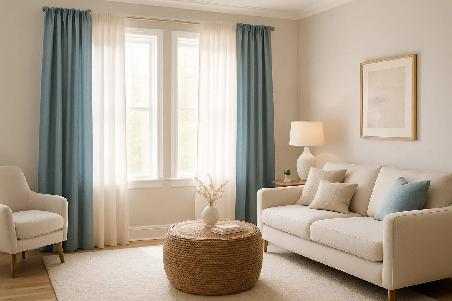
For Living Rooms: This multi-purpose space needs versatile colors that can transition from energetic daytime gatherings to relaxed evening unwinding. Neutral curtains in beiges, grays, or soft whites offer flexibility, while accent colors can be introduced through pillows or throws. That said, a living room also presents an opportunity for color statements – emerald green curtains, for instance, can add richness and character without overwhelming the space.
For Home Offices: Productivity and focus are key here. Moderate blues and greens have been shown to enhance concentration and efficiency. I recently consulted with a freelance writer who switched from white to soft teal curtains in her office and reported feeling more creative and less distracted during work hours. Yellow can also stimulate creativity but opt for muted tones to prevent overstimulation.
For Kitchens: Though not all kitchens have curtains, those that do can benefit from appetizing yet clean colors. Soft yellows and greens create a fresh, welcoming atmosphere. I once visited a farmhouse with buttery yellow kitchen curtains that somehow made every meal feel more special and homemade, even when we were just having takeout!
For Children’s Rooms: While primary colors are traditional choices, don’t feel limited to the crayon box basics. Consider the individual child’s temperament – an active child might benefit from calming blues or greens, while a more reserved child might thrive with stimulating (but not overwhelming) colors like coral or sunny yellow.
Combining Colors for Harmonious Decor
Creating color harmony isn’t about matching everything perfectly – it’s about creating thoughtful relationships between colors that enhance rather than fight each other.
The color wheel is your best friend here. Complementary colors (those opposite each other on the wheel, like blue and orange) create vibrant, high-energy contrasts. In my guest room, I paired terracotta curtains with blue-gray walls, and visitors always comment on how “put together” the space feels.
Analogous color schemes (using colors adjacent on the wheel) create more subtle, harmonious transitions. Think navy curtains with teal and purple accents throughout the room – it feels cohesive without being monotonous.
Then there’s the 60-30-10 rule, a designer’s secret weapon. Allocate 60% of the room to a dominant color (often walls), 30% to a secondary color (like curtains and larger furniture pieces), and 10% to accent colors. This creates balance while preventing any single color from overwhelming the space.
Don’t forget about patterns, either! Patterned curtains can tie together multiple colors in a room. I recently helped a friend select curtains with a subtle botanical pattern that incorporated both her wall color and furniture tones – the effect tied everything together beautifully.
Balancing Bold and Neutral Hues
Here’s where the real art of color psychology comes in – finding that sweet spot between expression and comfort.
Bold curtains can serve as striking focal points, but they need breathing room. If you’re drawn to dramatic emerald or ruby curtains, balance them with neutral furnishings to prevent visual overwhelm. I once visited a home with stunning peacock blue curtains that worked beautifully because everything else in the room was kept in creams and light woods.
Conversely, if your walls and furniture lean neutral, curtains offer a perfect opportunity to introduce color without commitment. Think of them as the scarves in your home’s wardrobe – easier to change than painting walls or replacing furniture.
Light-filtering properties also affect how curtain colors present themselves. A sunshine yellow appears dramatically different in sheer fabric versus blackout material. I learned this firsthand when installing mustard curtains in my sunroom – in sheer fabric, they cast a golden glow that transformed the space into something magical during daylight hours.
And don’t underestimate the power of neutrals with subtle undertones. A “greige” (gray-beige) with lavender undertones creates a sophisticated backdrop that subtly shifts with changing light throughout the day. These complex neutrals often feel more interesting and intentional than flat whites or beiges.
Finding Your Perfect Curtain Color
At the end of the day, while color psychology provides valuable guidelines, your personal response to colors should guide your final choices. We each have unique associations with different hues based on our experiences.
Start by noticing which colors consistently make you feel good. Pay attention to rooms you’ve felt particularly comfortable in – what colors were present? I keep a folder of photos from spaces where I’ve felt my best, and certain colors consistently appear (sage green and dusty blues, in my case).
Consider the natural light in your space too. North-facing rooms receive cooler light that can make cool colors appear more intense and warm colors more muted. South-facing rooms with warm light can support either warm or cool tones beautifully.
Don’t rush the process. Collect fabric swatches, hang them temporarily, and observe how they look at different times of day. What feels energizing in morning light might feel overwhelming by evening.
Remember that the perfect curtain color creates the emotional atmosphere you want for each specific space. When you find that sweet spot where aesthetics and emotional response align, you’ll have curtains that do more than just look good – they’ll actively contribute to how you feel in your home every single day.
If this guide has helped you see curtains in a new light (pun absolutely intended), I’d love for you to share it with friends who might be contemplating their own window treatment choices. Happy decorating!