Hey there! Let’s talk about something that seems simple but can honestly make or break a room: curtains. Specifically, how to match them with your wall color. I know, I know, sounds like we’re diving deep into the design weeds here, but trust me, getting this right is a game-changer. I remember agonizing over curtains for my first apartment – I had these lovely (read: landlord special) beige walls, and I ended up with some questionable floral print curtains that clashed spectacularly. Live and learn, right? It took me a while, and maybe a few design courses later, to really grasp how walls and window treatments can work together to create something truly special. So, let’s skip the questionable floral phase for you and get straight to making your windows look amazing.
The Basics of Color Theory in Interior Design
Okay, before we jump into specific pairings, let’s quickly touch on the ‘why’ behind it all – color theory. Don’t worry, I’m not going to throw a complex textbook at you. Think of it more like the basic grammar of design. Understanding a little bit about how colors interact helps immensely when you’re standing in a store, fabric swatches in hand, feeling completely overwhelmed.
Remember the color wheel from art class? It’s still your best friend here. You’ve got your primary colors (red, yellow, blue), secondary (green, orange, violet – made by mixing primaries), and tertiary colors (the blends in between). Colors are also generally categorized as warm (reds, oranges, yellows – cozy, energetic) or cool (blues, greens, violets – calming, spacious). And then there are the neutrals (beiges, grays, whites, blacks, browns) – the versatile peacemakers of the design world.
Why does this matter for curtains and walls? Well, the relationship between the colors you choose affects the whole mood and perception of your space.
- Want harmony? Stick to colors close to each other on the wheel (analogous) or different shades of the same color (monochromatic).
- Craving energy? Look at colors opposite each other (complementary).
- Need flexibility? Neutrals are your go-to.
Think about the feeling you want in the room. A calm bedroom might lean towards cool tones or soft neutrals. A lively living room could handle warmer hues or a pop of contrast. It’s all about intention.
How to Coordinate Curtain Colors with Wall Paint
Alright, let’s get practical. You’ve got your wall color, now what about the curtains? Here are a few tried-and-true strategies:
- The Safe Bet: Go Neutral: You really can’t go wrong pairing almost any wall color with neutral curtains. Think shades of white, cream, beige, grey, or even a soft taupe. This works beautifully if your walls are already a statement color, or if you just prefer a calm, understated look. My living room has navy blue walls (a bold choice, I admit!), and I opted for simple, off-white linen curtains. They soften the deep blue without competing, keeping the focus on the wall color while still framing the windows nicely. Neutral curtains are also great because they easily transition if you decide to repaint your walls down the line.
- The Subtle Shift: Monochromatic: This involves choosing curtains that are the same color as your walls, just a few shades lighter or darker. So, if you have light grey walls, charcoal grey curtains can look incredibly chic and sophisticated. Or pale blue walls with navy curtains? Classic. This creates a cohesive, layered look that feels intentional and pulled-together. It adds depth without introducing a new color, making the room feel unified.
- The Color Match: Pick from the Palette: If your walls are neutral, your curtains are a fantastic opportunity to introduce color. Look around the room – what colors are in your rug, your sofa, your throw pillows, or your artwork? Pulling one of those accent colors for your curtains ties everything together beautifully. For example, if you have a predominantly neutral room but your rug has touches of emerald green, emerald green curtains can be stunning. It makes the choice feel deliberate and integrated.
- Pattern Power: If you have solid walls, patterned curtains can add personality and visual interest. The key is to ensure one of the colors in the pattern relates to the wall color or other elements in the room. Conversely, if you have patterned wallpaper (go you!), solid-colored curtains are usually the way to go. Pick a color from the wallpaper pattern for a seamless look. Just be mindful of scale – a large, bold pattern works best in bigger rooms, while smaller, more delicate patterns suit cozier spaces.
Achieving Balance with Complementary Hues
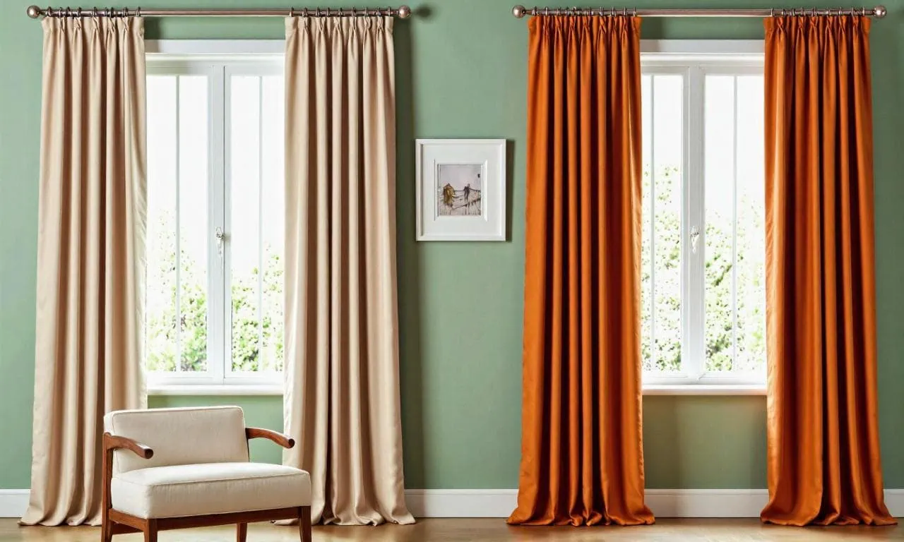
Ready to be a bit bolder? Let’s talk complementary colors. These are the colors directly opposite each other on the color wheel – think blue and orange, red and green, yellow and violet. Pairing complementary colors creates high contrast and energy. Now, putting fire-engine red curtains against kelly green walls might be… a lot. Unless you’re going for a very specific, high-impact vibe (maybe a fun kid’s room?), using complementary colors often works best with a bit of nuance.
Instead of solid blocks of opposing colors, consider these approaches:
- Muted Tones: Use softer, less saturated versions of complementary colors. Think dusty rose curtains against sage green walls, or navy blue walls with curtains in a muted terracotta or burnt orange. This gives you that pleasing contrast without being visually jarring. I once helped a client who had beautiful pale yellow walls but wanted something more interesting than beige curtains. We landed on curtains in a soft lavender – the complementary color – and it just worked. It added a touch of unexpected elegance.
- Accents Only: Use the complementary color sparingly. Maybe your curtains are neutral, but they have a trim, border, or subtle pattern featuring the wall’s complement. Or, perhaps the curtains are solid, but you use the complementary color in pillows or artwork nearby. This creates little moments of visual excitement and balance.
- One Star Player: If you have neutral walls, you can absolutely go for curtains in a strong, complementary color if that color is repeated elsewhere as an accent. Imagine grey walls, vibrant teal curtains, and a few teal accessories scattered around the room. The curtains become a focal point, balanced by the echoes of teal elsewhere.
The goal with complementary colors isn’t necessarily to have them fight, but to make each other pop in a balanced way. It takes a bit more confidence, but the payoff can be a room that feels dynamic and thoughtfully designed.
Using Curtains to Add Contrast and Depth
Beyond just color matching, curtains are brilliant tools for adding contrast and depth, really shaping the feel of your space.
- Light Walls, Dark Curtains: This is a classic for a reason. Pairing light walls (white, cream, light grey, pastels) with dark curtains (charcoal, navy, deep brown, forest green, even black) creates instant drama and sophistication. The dark curtains frame the window, drawing the eye and making the window itself a feature. It can also make a room feel a bit cozier or more grounded. Just be mindful that dark curtains absorb light, so this works best in rooms that get plenty of natural light to begin with, unless you’re intentionally going for a moody vibe (hello, home theater!).
- Dark Walls, Light Curtains: Conversely, light curtains against dark walls provide a striking contrast that feels fresh and airy. As I mentioned with my navy living room, the off-white curtains prevent the dark walls from feeling too heavy and actually make the room feel brighter by reflecting light. This contrast highlights the architectural feature of the window beautifully.
- Texture Talks: Contrast isn’t just about color! Think about texture. If you have smooth, flat-painted walls, curtains with a distinct texture – like velvet, linen, boucle, or even a heavy weave – add incredible depth and tactile interest. Imagine smooth plaster walls paired with plush velvet curtains. Even if the colors are similar (say, greige walls and slightly darker greige velvet), the textural difference creates a subtle, luxurious contrast. Conversely, if you have textured walls (like brick or paneling), smoother curtain fabrics like silk or cotton sateen can provide a sleek counterpoint. Don’t underestimate the power of touch and feel!
- Sheer Genius: Don’t forget sheer curtains! Layering sheers underneath heavier drapes adds depth and flexibility. You get privacy and filtered light during the day with the sheers, and full light blocking or a more dramatic look at night with the main curtains. This layering also adds visual depth around the window.
Playing with contrast, whether through color, light/dark values, or texture, is how you elevate your window treatments from purely functional to a key design element.
Wrapping It Up
Whew! We’ve covered quite a bit, from the color wheel basics to specific strategies for pairing curtains and walls. Remember, these are guidelines, not hard-and-fast rules. The most important thing? That you love how your space feels.
Think about the mood you want to create, consider the light in your room, and don’t be afraid to experiment. Sometimes the most unexpected pairing turns out to be your favorite. Grab some fabric samples, hold them up against your wall in different lights, and trust your gut. Choosing curtains should be fun – it’s like picking the perfect accessory for your room’s outfit!
I hope this little guide gives you the confidence to tackle those window treatments like a pro. Getting the relationship between your walls and curtains right can truly transform your space from “meh” to “wow.”
If you found this helpful, please feel free to share it with anyone else wrestling with their window décor! Happy decorating!